When you’re standing in front of your closet thinking, “Why does this look good on the hanger but weird on me?”, the problem is often color harmony, not the individual pieces. A reliable outfit color matcher isn’t about memorizing “rules” like “never wear brown with black.” It’s a repeatable method that helps you combine colors (and prints) so the final outfit looks intentional—whether you’re dressing for work, travel, a wedding, or everyday errands.
This guide teaches a simple, stylist-level approach to color matching using three ideas: undertone, contrast, and color roles (base, accent, and bridge). You’ll also get combination formulas, a quick table of go-to pairings, and a way to test outfits from photos so you waste less time changing clothes.
What an Outfit Color Matcher Really Does
An outfit color matcher is any process (mental or digital) that answers two questions:
- Do these colors belong together? (harmony)
- Do these colors belong on me? (flattery)
Harmony is mostly about relationships between colors: contrast, temperature, and repetition. Flattery depends on your skin/hair/eye coloring and how close the outfit sits to your face (tops, scarves, jackets matter more than shoes).
Stylist shortcut: If the outfit repeats one color (or undertone) at least twice, it almost always looks more “pulled together.”
The 3 Color Levers That Make Outfits Work
1) Undertone (warm vs cool vs neutral)
Undertone is the hidden temperature in a color. Two greens can look totally different: one leans yellow (warm) and one leans blue (cool). Mixing undertones can work, but beginners get more consistent results by choosing a “temperature lane” for the outfit.
- Warm-leaning colors: cream, camel, rust, olive, tomato red, golden yellow
- Cool-leaning colors: crisp white, charcoal, navy, cobalt, icy pink, blue-red
- Neutral-leaning colors: true black, some grays, denim mid-blue, some taupes
Quick check: Hold a color next to your face in daylight. If your skin looks brighter and more even, it’s likely aligned with your undertone. If shadows/texture look emphasized, it may be fighting you.
2) Value (light vs dark)
Value is how light or dark a color is. Many outfits feel “off” because the value contrast is accidental. Example: a very dark top with very dark pants can look sleek, but if your shoes are a medium value and your bag is bright, the outfit can feel unbalanced.
- High value contrast: light + dark (e.g., white shirt + dark jeans)
- Low value contrast: similar lightness (e.g., cream knit + beige trousers)
High contrast reads sharper and more formal; low contrast reads softer and often more casual.
3) Saturation (muted vs bright)
Saturation is intensity. Muted colors (dusty rose, sage, stone) play well together. Brighter colors (fuchsia, cobalt, lime) also play well together. Problems happen when you mix a muted piece with a very bright piece and don’t add a “bridge” item to connect them.
Rule of thumb: Match saturation levels first, then adjust with neutrals.
The Outfit Color Matcher Method (Base–Accent–Bridge)
Instead of trying to match every piece to every other piece, assign roles:
- Base color (60–80%): the main neutral or main color (pants, dress, coat).
- Accent color (10–30%): the “pop” (top, scarf, heels, bag).
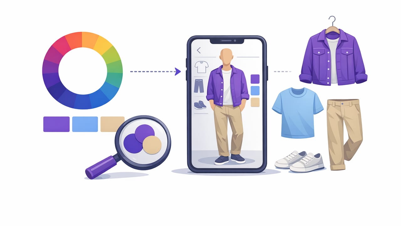
- Bridge color (5–20%): the connector that repeats either the base or the accent (belt, jewelry, print, cardigan).
This structure is the easiest way to make outfits look intentional, especially when you’re mixing warm/cool or muted/bright.
Example formulas you can copy
- Neutral base + colored accent + repeat: navy trousers + ivory tee + burgundy shoes (burgundy repeats in lipstick or bag).
- Monochrome + texture: all camel tones + suede/knit/leather contrast.
- Print as the bridge: black pants + red top + scarf that contains black and red.
Outfit Color Matcher Cheat Sheet (Reliable Pairings)
Use this table as a starting point, then adjust for undertone and saturation.
| Base Color | Easy Accents | Best “Bridge” Ideas |
|---|---|---|
| Navy | White, camel, blush, red, light blue | Denim, gold jewelry, striped tops |
| Black | White, gray, cobalt, emerald, pink | Silver jewelry, black-and-white print |
| Cream/Ivory | Olive, rust, chocolate, navy | Tortoiseshell accessories, warm metals |
| Gray (mid) | Burgundy, forest, pastel blue, lavender | Charcoal shoes, heathered knits |
| Denim (mid blue) | White, black, tan, red, yellow | Brown belt, sneakers matching the top |
How to Match Prints Without Looking “Busy”
Prints are where a good outfit color matcher really earns its keep. The goal is to control scale, spacing, and color repetition.
Print matching rules that actually work
- Repeat one color from the print in another item (top, shoe, bag). This is the fastest way to look coordinated.
- Mix scales: pair a small print (micro-stripe) with a larger print (bold floral) if they share a color family.
- Use a “quiet” neutral: if the print is high contrast, keep the rest solid and simple.
- Match background colors: a floral with a navy background pairs easily with navy trousers, even if the flowers are bright.
If you’re unsure, treat the print as your accent and make everything else the base and bridge.
Pick Your Contrast Level (It Changes the Whole Outfit)
Contrast is how different your outfit pieces are from each other—and from you. It affects whether an outfit reads classic, soft, edgy, or bold.
- Low-contrast outfits (similar values) feel modern and streamlined: oatmeal + sand + camel.
- Medium contrast is the most versatile: denim + white + tan accessories.
- High contrast feels dramatic and polished: black + white + a saturated accent.
If your natural coloring is high contrast (dark hair + light skin), you can often wear higher contrast outfits effortlessly. If you’re lower contrast (soft hair/skin tones), medium-to-low contrast outfits can look more harmonious—especially near the face.
Use Photos as Your “Color Lab” (Fast, Objective, No Guessing)
Your mirror can lie because lighting changes everything. Photos make your outfit color matcher process more objective.
Simple workflow
- Take a quick photo in daylight (near a window).
- Convert the photo to black-and-white to check value contrast. If the shapes blur together unintentionally, adjust with a lighter/darker layer or accessory.
- Check for color repetition: is there at least one color echoed twice (top + shoe, print + bag, etc.)?
- Check temperature consistency near your face (top, scarf, jacket). If you look washed out, swap the top before changing everything else.
Optional: extract a simple palette from a clothing photo
If you like techy solutions, you can pull a rough color palette from a clothing image and match other items to it. Here’s a minimal example using Python (conceptual; you’d need an image file and the listed libraries installed):
from PIL import Image
import numpy as np

def dominant_colors(path, k=5):
    img = Image.open(path).convert('RGB')
    img = img.resize((200, 200))
    pixels = np.array(img).reshape(-1, 3)

    # Simple random sampling to approximate dominant colors
    sample = pixels[np.random.choice(len(pixels), 5000, replace=False)]

    # K-means (requires scikit-learn)
    from sklearn.cluster import KMeans
    km = KMeans(n_clusters=k, n_init='auto')
    km.fit(sample)

    centers = km.cluster_centers_.astype(int)
    return [tuple(c) for c in centers]

print(dominant_colors('my_blazer.jpg'))
You can then compare those RGB values to other items (or convert to HSL/HSV) to see if two pieces share similar temperature and saturation.
Common Color-Matching Problems (and Fixes)
“My outfit looks random.”
Fix: Add a bridge that repeats a color—belt, shoes, bag, earrings, or a scarf that contains both colors.
“It matches, but it doesn’t flatter me.”
Fix: Change the color closest to your face first. Swap the top, add a scarf, or change the jacket. Keep the rest of the outfit if it’s working.
“The colors are fine, but it feels loud.”
Fix: Lower saturation in one area (choose muted accessories) or reduce contrast (swap stark white for cream; swap black for charcoal).
“I don’t know what neutral to use.”
Fix: Choose the neutral based on undertone:
- Warm neutrals: cream, camel, warm taupe, chocolate
- Cool neutrals: crisp white, charcoal, navy, cool gray
Build Your Personal Outfit Color Matcher in 10 Minutes
Do this once and outfit planning gets dramatically faster.
- Choose 2 “home base” neutrals: one dark (navy/black/charcoal) and one light (cream/white/stone).
- Pick 3 accents you love near your face: e.g., burgundy, teal, blush.
- Pick 1 metal: gold (often reads warmer) or silver (often reads cooler).
- Create 5 go-to formulas: (1) neutral + accent + repeat, (2) monochrome, (3) denim base, (4) print-as-bridge, (5) tonal neutrals.
When shopping later, buy items that fit into these roles. That’s how you end up with a closet where most things match without effort.
FAQ: Outfit Color Matcher Questions
Is there a “best” color combination for everyone?
No—because flattery depends on undertone and contrast. But there are universally reliable structures: one base + one accent + one bridge, and repeating a color at least twice.
Can I mix warm and cool colors?
Yes. Make it intentional by adding a bridge (a print, accessory, or neutral) that contains both temperatures, or keep one temperature dominant and the other as a small accent.
How many colors should an outfit have?
For most everyday looks, 2–3 colors plus a neutral reads polished. More colors can work if the print ties them together.
Putting It All Together
A strong outfit color matcher isn’t about restricting your style—it’s about making your wardrobe easier to use. Start by matching undertone and saturation, choose a contrast level, and then build outfits using the base–accent–bridge structure. If you want to speed up decisions, testing combinations from photos (and saving the winners) can be surprisingly effective.
If you prefer doing that digitally, an iOS wardrobe tool like Outfit Maker can help you visualize combinations and keep your best color pairings organized—without needing to try everything on again.